Skip to content


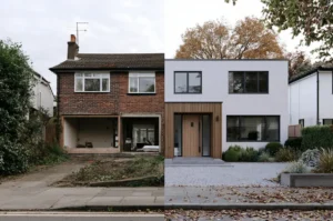
Gray is finished. Not fading — finished, at least as the color a whole street reaches for by default, and the 2026 exterior paint color trends all point to what replaces it. I’ve spent the season pulling paint decks apart for facades, and the picture is unusually clear: nearly every major brand has landed on the same two instincts. One half of the year wants warmth you can almost touch — khaki, espresso, clay, cream. The other wants depth borrowed straight from the landscape — smoky jade, forest, an off-black with brown in its bones. This guide ranks all of it for the surface that actually decides whether a color works: a large, sun-hit wall, not a chip under store lighting. You’ll get every 2026 Color of the Year that earns its place outdoors, the schemes that hold up, the real cost of the job, and the mistakes I’d talk you out of before you buy a single gallon.
The 2026 story, in one line
Read the whole year’s Color of the Year announcements together and they aren’t fourteen different directions — they’re two sides of one mood. On one side sits weightless light: creams, warm whites, and the tan-that-thinks-it’s-a-neutral. On the other sits tactile earth: browns, greens, and blue-greens pulled from soil and shade. Both point away from the cool, screen-bright grays of the last decade and toward color that ties a house to the ground it stands on. For an exterior, that’s good news — earthy and mid-depth colors are exactly the ones that behave well against sky, brick, roof, and a green yard.
The 2026 Colors of the Year, ranked for exteriors
Most roundups list these picks in the order the brands announced them. That’s useless outdoors, because a color chosen for a moody dining room can fall apart on a west-facing wall. Here they are ranked by how well they actually perform on a facade.
1. Universal Khaki (Sherwin-Williams SW 6150) — the one to beat
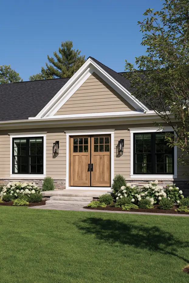
Universal Khaki is the pick built for the outside of a house. It’s a warm mid-tone that lives between beige and taupe, with an LRV around 44 — dark enough to look deliberate, light enough to keep heat and fade in check. Sherwin-Williams and its HGTV Home line both crowned it, which almost never happens. On siding, stucco, or a craftsman body it reads as a considered neutral rather than an absence of decision, and it flatters red brick and natural wood instead of fighting them. Pair it with a warm off-white trim like Greek Villa or Oyster White. Skip a stark, blue-white — it’ll turn the khaki muddy.
Designer tip: a mid-LRV body color like this one is the safest way to “go warm” without committing to full color. It updates a dated tan house in a single weekend of sampling.
2. Warm Eucalyptus (Valspar 8004-28F) — green that behaves like a neutral
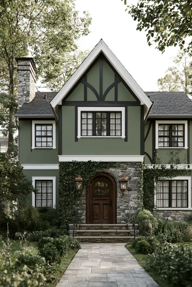
Here’s the trick of this one: it’s unmistakably green, yet it carries itself like a neutral. A silver-tinted, retro-leaning sage with enough gray in it that traditional neighbourhoods and HOAs wave it through without a fight — while still tying a facade to the trees and lawn around it. Valspar pairs it with Degas Blue and a deep brown called Groundbreaking, a ground-to-sky trio that looks right on everything from a low ranch to a two-storey with real bones. Buying from an independent dealer rather than Lowe’s? The matched shade goes by Sage Slate (V143-5). It shifts with the light too — softer and grayer in shade, deeper and greener in full sun — so test both names on the wall that matters before you assume they’re identical.
3. Hidden Gem (Behr N430-6A) — for the homeowner who wants color, not another neutral
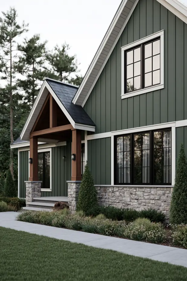
Worried a jewel tone is too much for a whole house? It usually isn’t, if you choose the right one. Hidden Gem is a smoky jade — a blue-green that reads sage in flat morning light and shifts toward teal-gray by dusk. That shift is the point and the risk: sample it on the wall that gets the least sun, because that’s where it goes darkest. It’s a genuine statement body color on a clean-lined modern or a shingled coastal home, and it looks expensive next to crisp white trim, walnut-toned wood, and aged-brass fixtures.
4. Silhouette (Benjamin Moore AF-655) — the warm black, done right
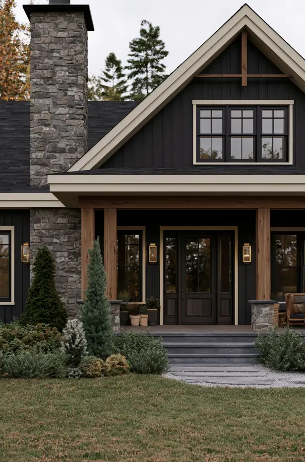
Here’s the designer move behind 2026’s dark exteriors: nobody wants true black anymore. Silhouette is espresso cut with charcoal and a whisper of burnt umber, inspired by tailored suiting — a color that gives you the drama of near-black without the cold, harsh edge that made all-black houses feel like a phase. Used full-body on a modern farmhouse or a boxy modern, it turns stone, natural wood, and brass into the accents. Benjamin Moore’s own trim mates — Swiss Coffee (OC-45) for creamy contrast, Sherwood Tan (1054) — do the softening. Reserve the deepest version for a home with strong architectural lines; on a fussy facade, all that depth just swallows the detail.
5. Warm Mahogany (Glidden / Pittsburgh Paint Co PPG1060-7) — the sleeper accent
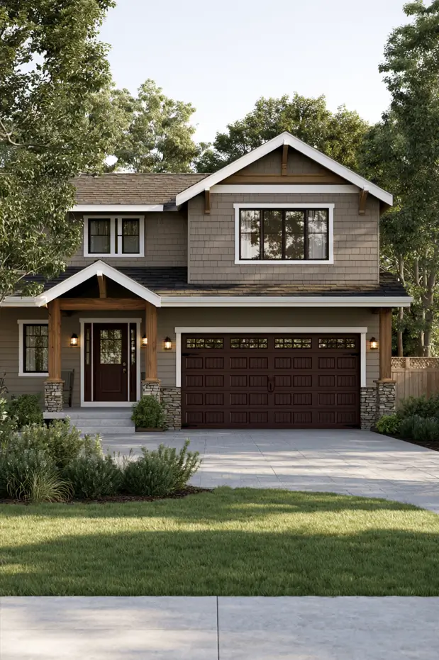
Picture a cream or greige house with a plain front door, the kind of entrance your eye slides right past. Now paint that door a deep berry-brown — a red with soil in it, not a fire-engine red — and add an oil-rubbed bronze handle. The whole facade suddenly has a focal point it didn’t have five minutes ago. That’s the smartest use of Glidden’s 150th-anniversary pick outdoors: not as a body color, but as the anchor on a door, shutters, or a garage. It sits between traditional and unexpected, which is a hard place to land.
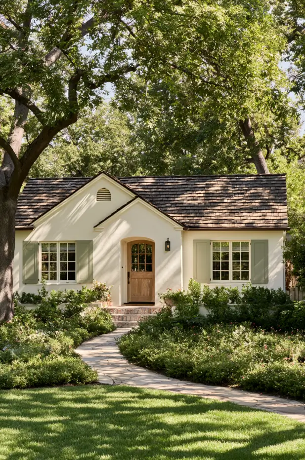
6. Melodious Ivory (Dutch Boy 313-2DB) — the warm white that isn’t boring
Cream is having its moment because bright, chalky white finally wore out its welcome. Melodious Ivory is a creamy neutral with enough pigment to avoid the flat, builder-grade look, and it works as a full-body color on cottages, colonials, and farmhouses that want light without glare. On an exterior, a warm white like this needs a partner with some contrast — a sage or a bronzed brown on the shutters and door — or the facade reads undressed.
313-2DB)
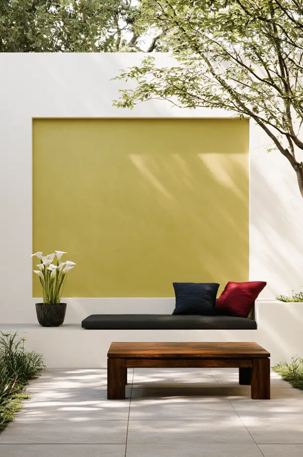
7. Secret Safari (PPG PPG1110-4) — the wildcard
This is the one you use with a scalpel, not a roller. Secret Safari is a botanical yellow-green that shifts with the light, and it’s too much for a whole facade — but as a single accent it’s brilliant: a recessed courtyard panel, a painted planter wall, the back of a garden niche. Give it crisp white around it and it stops looking like a paint choice and starts looking like art. It’s the clearest signal of where the green trend is heading next — warmer, more olive — and a low-risk way to test that direction before it reaches your siding.
Also worth knowing: Pantone crowned Cloud Dancer, its first true white, and Dunn-Edwards chose Midnight Garden, a deep muted green — two more votes for the light-versus-earth split running through the whole year.
Five directional trends bigger than any single color
The Colors of the Year are marketing. These are the movements actually showing up on real facades, and they’ll outlast any one paint code.
The new neutrals are warm
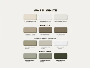
Cool grays and stark whites are being quietly retired in favor of creamy whites, mushroom taupes, greige, and khaki. The shift is the same one that already happened indoors, now migrating outside. If your house is currently a cool gray and you want the cheapest possible update, moving to a warm greige of similar depth reads as “renovated” from the curb for the price of paint alone.
Biophilic greens, from sage to forest
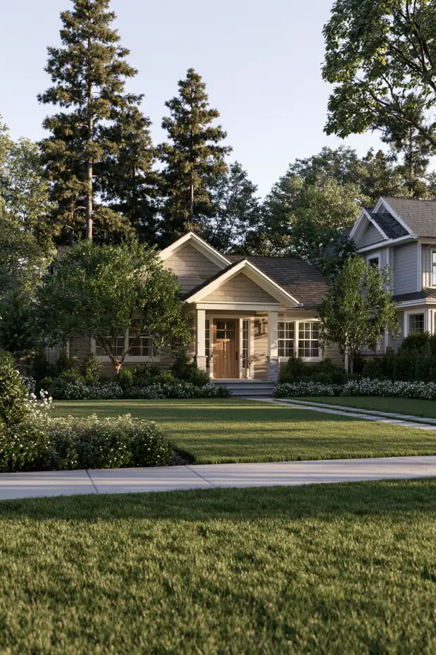
Green is the runaway story of 2026, and it spans the whole range — silvery sage, olive, deep forest, smoky jade. It works outdoors for an obvious reason: it’s the one color family your landscaping already agrees with. Designer Michelle Murphy has spoken about wanting deeper, grounded greens on facades; the safe entry point is a muted sage that reads almost neutral from the street, with a forest or hunter tone held back for the door.
Warm blacks and browns replace the cold moody look
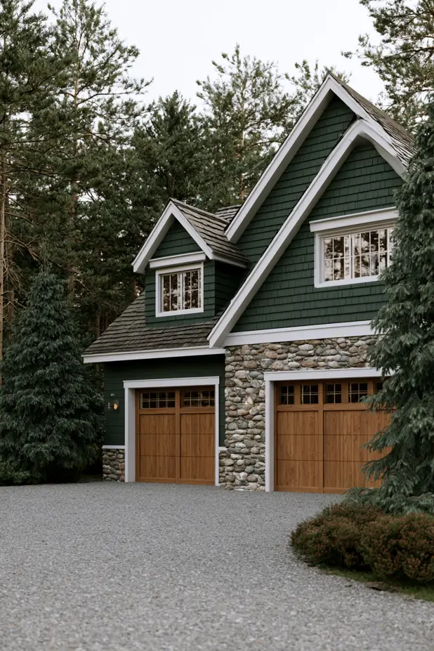
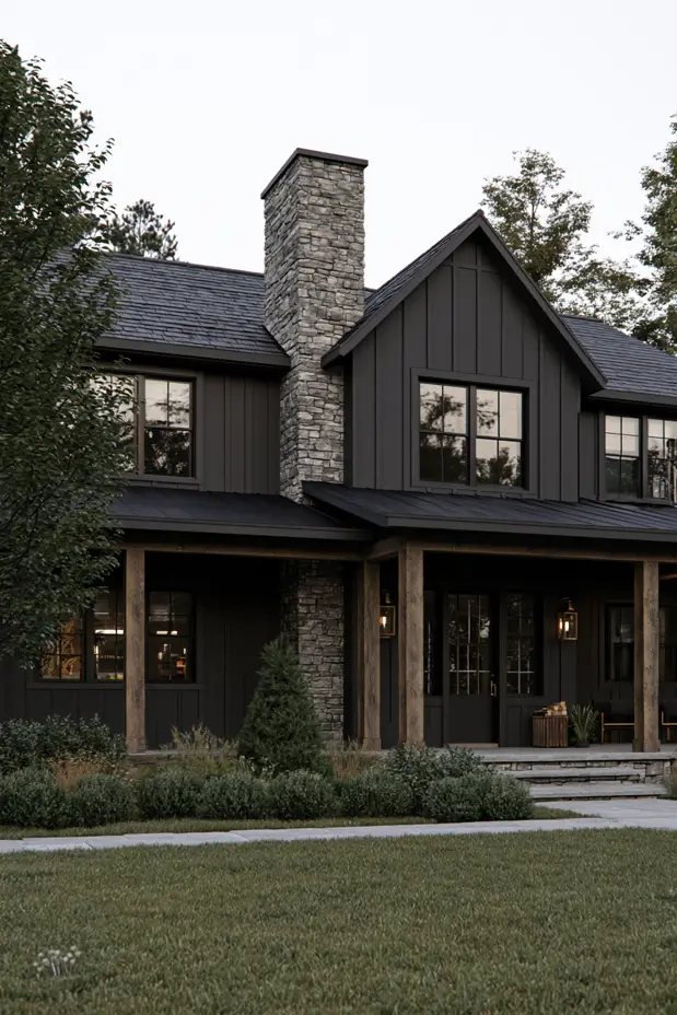
Dark exteriors aren’t going anywhere, but the temperature changed. Designers including Britany Simon and Sarah Akbary are pairing off-blacks and espresso browns with charred wood, matte metal, stone, and aged brass — layered, tactile, deliberately un-sleek. The tell of a dated dark house is a pure, blue-black; the 2026 version leans brown and reads far more inviting. Farrow & Ball’s Broccoli Brown and Benjamin Moore’s Silhouette and Wrought Iron come up again and again in designer picks.
Earthy terracotta, clay, and ochre
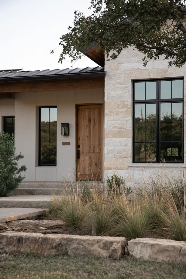
A revival of desert and Mediterranean warmth is pushing terracotta, clay, and mauve-taupe onto facades, especially on stucco, Spanish, and Hill Country styles where the material already wants a warm tone. Huma Sulaiman has named aubergine, olive, ochre, and mauve-taupe as the palette she sees becoming standard. Outdoors, these read best where warm stone or a terracotta-tile roof gives them a partner to echo.
The reversed palette: dark body, light trim
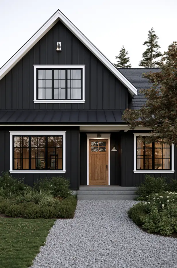
The traditional formula — light house, dark shutters — is getting flipped. A dark body with crisp light trim and light-toned window casings has real architectural punch, particularly on modern and modern-farmhouse builds. The move only works if your trim genuinely contrasts; a dark body with barely-lighter trim just looks unfinished.
How to build a whole scheme, not just pick a body color
A facade is never one color, and the single biggest reason paint jobs disappoint is that people choose the body in isolation and improvise the rest. Use a three-part structure.
Work to a 60-30-10 split. Roughly 60% is your body color, 30% is trim and secondary material (a gable, a base course, stone), and 10% is the accent — almost always the front door, sometimes shutters. Getting the proportions right matters more than the individual colors.
Let the fixed elements vote first. Your roof, brick, stone, and any stained wood aren’t changing, and they carry undertones that will make or break your paint. A warm-toned roof kills a cool-gray body; red brick wants a warm white or a khaki, not a pink-beige. Choose your body color against the things you can’t repaint, not against a mood board.
Make the door do the talking. The cheapest high-impact move in exterior color is a saturated door against a restrained body — Warm Mahogany, a forest green, a deep blue. It’s a single quart and an afternoon.
On black windows: they’ve been the default for a decade and they aren’t vanishing, but the crispest 2026 look softens them by pulling the body toward warm rather than cool, so the black frames read as intentional contrast instead of a hard grid.
Make it survive the wall: sheen, LRV, and heat
This is the section the trend roundups skip, and it’s where a color lives or dies.
LRV and heat go together. Light Reflectance Value is how much light a color bounces back — higher is lighter. The lower the LRV, the more heat the wall absorbs and the faster the color fades under UV. That’s why a mid-tone like Universal Khaki (LRV ~44) is a lower-maintenance choice than a deep charcoal on a west-facing wall that bakes all afternoon.
Dark color plus vinyl is a real hazard. Deep colors absorb enough heat to warp vinyl siding, and many vinyl warranties exclude dark shades outright. If your siding is vinyl and you want to go moody, buy only paint labeled “vinyl-safe,” which is formulated to reflect infrared and run cooler.
Sheen: satin is the exterior workhorse. Flat or matte hides surface flaws and glare — useful on dark colors and rough stucco — but it’s harder to wash. A low-lustre satin gives you the best balance of a modern non-shiny look and a surface you can actually scrub. Save semi-gloss for trim and doors, where you want durability and a little crispness.
Humid climate? Read this twice. In warm, humid air, your enemies are mildew and algae, especially on north-facing and shaded walls that never fully dry. Two defenses: choose a paint with a mildewcide additive (most premium exterior lines have one), and lean toward mid and lighter LRVs that shed heat and show a chalky, faded finish less quickly under intense sun. A scrubbable satin beats a flat here, because you will be washing the shaded elevations.
Paint tier is the most expensive decision you’ll make. Sherwin-Williams alone runs four exterior tiers — Emerald (premium, roughly a 30-year warranty), Duration, SuperPaint, and entry-level A-100 (around 15 years). On a hot south or west wall the gap is brutal: budget paint can chalk in a few years while a premium line holds its color past a decade. Buying cheap paint to save a few hundred dollars on a job that costs thousands is a false economy.
What the job actually costs. For a typical 2,000-square-foot US home, a professional exterior repaint runs about $3,000 to $8,000 in 2026, with the national average landing near $3,200 and per-square-foot pricing between roughly $1.50 and $4.50. Roughly 80% of homeowners land in the $3,000–$7,500 band. The paint itself is only 15–20% of the bill — labor and prep are the rest, which is exactly why skimping on the paint to save money makes so little sense. Prep drives the total: peeling paint, wood repair, and heavy washing push a job past $10,000. Aim to paint in the 50–85°F window with lower humidity so the film cures properly.
The mistakes I’d talk you out of
Sampling too small, on one wall, at one time of day. A color can look completely different at facade scale than on a chip, and it shifts hour to hour as the sun moves. Paint a 2-by-2-foot sample on at least two elevations and look at it in morning, midday, and evening light before you commit.
Ignoring the undertone that only shows up big. Grays go blue or purple, beiges go pink, greens go acid — undertones that are invisible on a chip can dominate a whole wall. The large sample is how you catch it.
Matching a color across brands. A paint store can machine-match almost any color, but a Sherwin-Williams formula mixed in another brand’s base won’t behave identically outdoors, where fade and undertone matter most. Buy the color in the brand that created it.
Chasing the trend past your fixed elements — or your HOA. A gorgeous color that clashes with your roof or your brick is a wasted job, and a gorgeous color your HOA rejects is a wasted weekend. Check both before you fall in love.
FAQ
What is the exterior paint color for 2026? There isn’t a single one, but the most exterior-ready Color of the Year is Sherwin-Williams’ Universal Khaki (SW 6150), a warm mid-tone neutral built for siding and stucco. The broader trend is warm, earthy neutrals and greens replacing cool grays.
Is gray out for 2026? As the default, yes — the industry has clearly pivoted to warm neutrals, greige, and khaki. Gray isn’t banned, but a cool blue-gray now reads as dated, while a warm-toned greige still feels current.
What color is replacing gray on house exteriors? Warm neutrals are the direct replacement: creamy whites, mushroom taupes, greige, and khaki, with muted sage green close behind for homeowners who want a touch of color that still behaves like a neutral.
Are dark exteriors still in style in 2026? Yes, but the temperature shifted. True, cool black is out; warm off-blacks and espresso browns — like Benjamin Moore’s Silhouette — are in, usually layered with wood, stone, and matte metal. On vinyl siding, use only “vinyl-safe” dark shades to avoid heat warping.
What’s the best exterior paint color for a hot, humid climate? Favor mid to lighter LRVs that reflect heat and show fading less, choose a premium line with a built-in mildewcide, and finish in a scrubbable satin so you can wash algae off shaded walls. Warm whites, khaki, and sage all perform well; save the deepest charcoals for shaded, north-facing elevations.
The one thing to do first
The trend that matters most in 2026 isn’t a color — it’s warmth, and the confidence to let a house look like it belongs to its landscape instead of a showroom. Whether you land on khaki, jade, or a warm near-black, don’t let a chip make the decision for you. Buy a quart of your top pick, paint a big square on two different walls, and live with it through a full day of light before you spend a dollar on the real job. The color that still looks right on Tuesday evening is the one worth painting a house.